SakeMaki
Role
Visual Identity
Logo Design
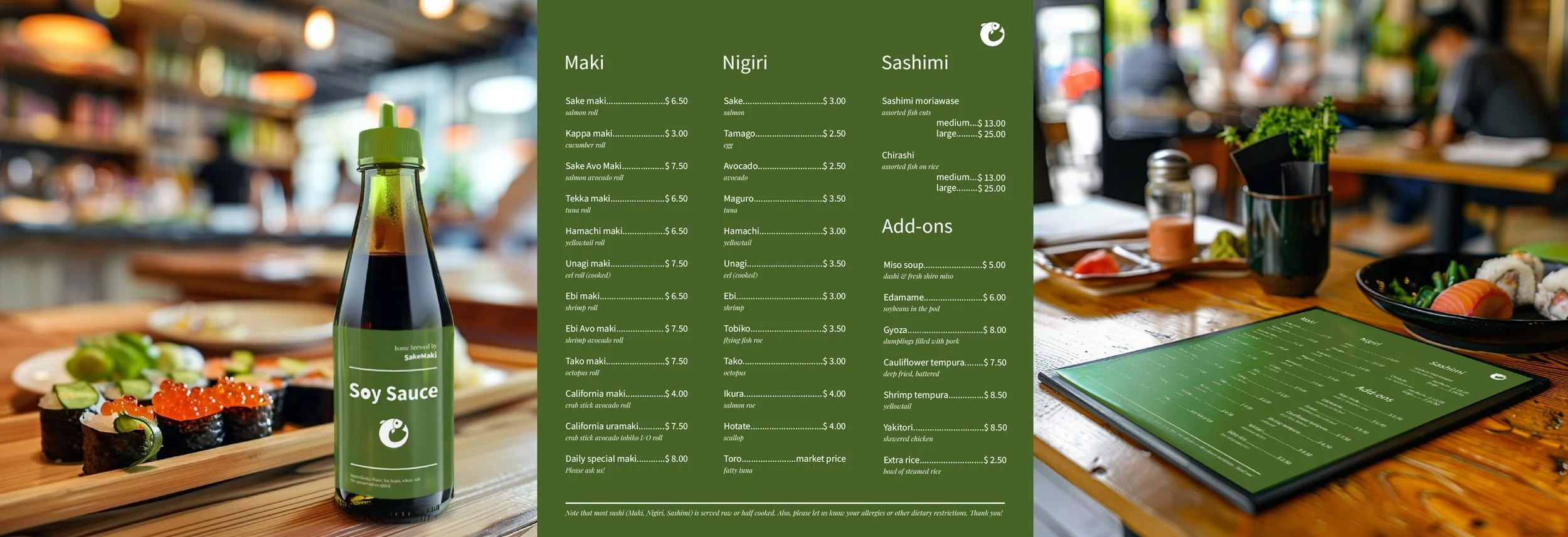
Collateral Design

SakeMaki is a small, employee-owned sushi restaurant & bar which aims to stand out with a loving attention to detail they put into every piece of sushi — as well as a fun, yet down to earth atmosphere. In designing the visual identity, we realized that most competitors either use a mixture of black & red color schemes or a more traditional, Japanese-style vibe with wooden or old paper elements.
With a combination of playful and sober type, a solid green color inspired by the peel of a cucumber and an overall balanced approach of whimsical and earnest, I designed a look & feel that represents their distinct identity to the outside and that invites guests to a friendly, fresh and reliable experience.
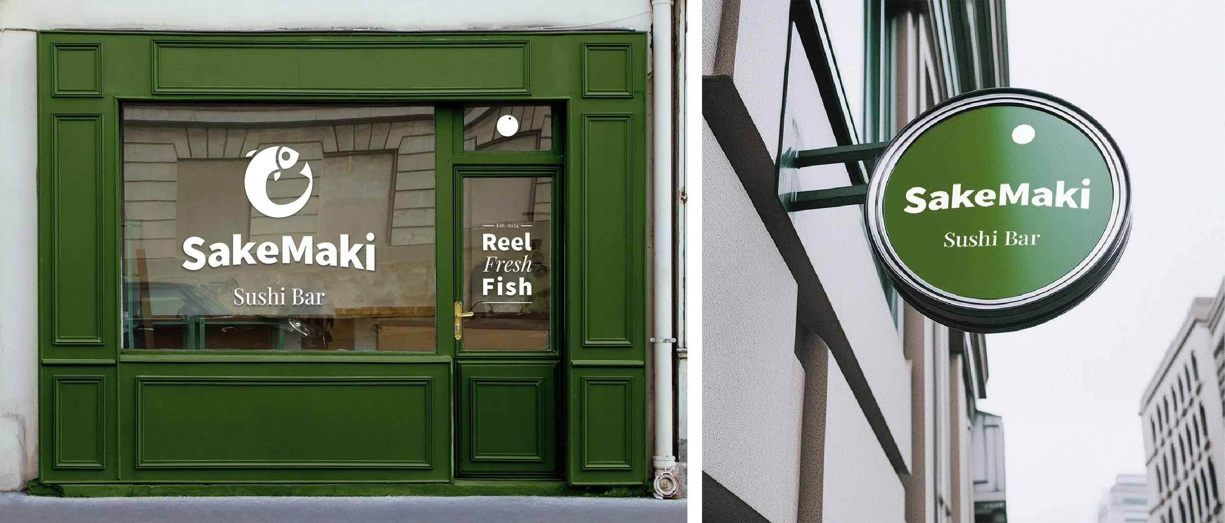
“SakeMaki” literally means salmon roll which was the directive in designing the logo for the establishment. The final mark is an iconographic yet fun representation of a jumping salmon that is rolled up into a circle (also notice details like the negative space in the center mirroring the salmons head). The logo itself can be further abstracted into a more subtle alternative merely consisting of two circles or rolls. Moreover, I designed a custom logotype based on the typeface Source Sans Variable which features the same circles as the counters/eyes of the vowels including the tittle of the i. The word mark is slightly arched to further accentuate the jolly nature and curvature of the design.
To counterbalance the rather lively logo and word mark, only the solid green color (denoted as kappa) and white (denoted as shari) are used throughout the identity embedded in an overall minimalistic design, in order to still invoke a grounded and trustworthy appearance. Similarly, the serif typeface Playfair used for body text brings back more sophisticated and familiar associations.