Creating a personal logo
Role
Visual Identity
Logo Design

While I was involved in many logo design processes over the course of my career, it wasn't until the beginning of 2024 that I needed my own personal logo as a freelancer. This was both an exciting and at the same time scary endeavor, as so many very subjective expectations (and biases) were connected with it.
But after some brainstorming and discovery, it became quite clear which aspects of my personal brand should be defining the direction:
My personal brand is ultimately just an agent to help other brands stand out. So, the logo itself should be very subtle, not following a trend, and abstract.
While there is an ongoing discussion whether a logo should explain rather than just identify, I personally always liked the hidden meaning in symbols. Therefore, it was clear to me that the logo should somehow incorporate the idea of the visual media that I focus on and at the same time have a hidden signature of my own…
My subjective preferences in graphic design are influenced by Bauhaus, Swiss design, and minimalism. At the same time my scientific background always skewed me towards the logical, geometric, and rational. Both fit very well with condition 1.), so while I did dozens of logo iterations, all of them used simple, flat, and monochromatic shapes.
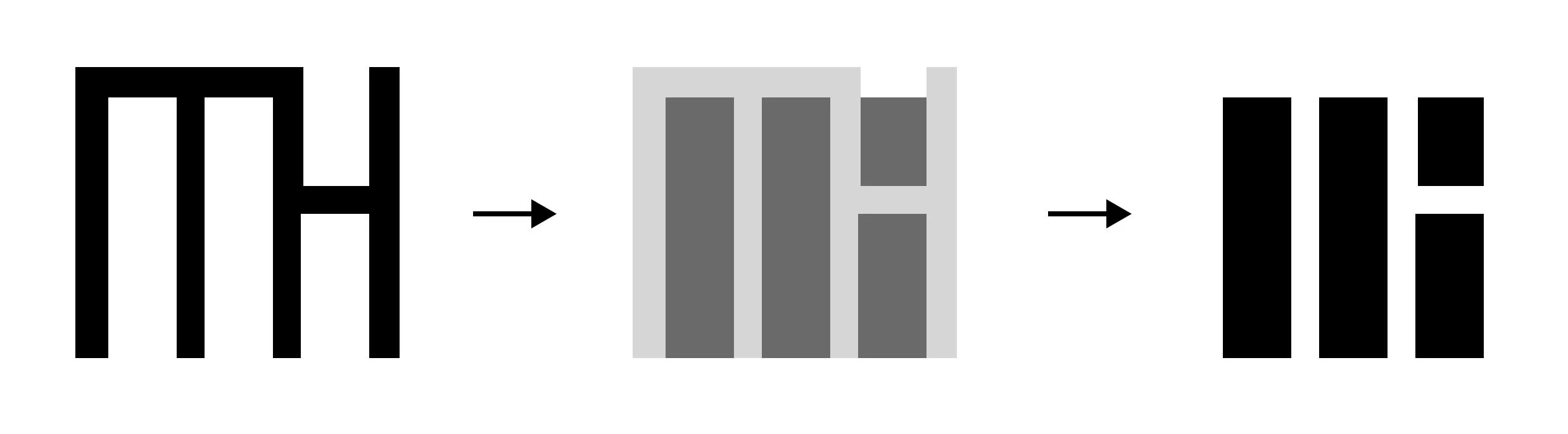
There are many “rules” in visual media which are designed to help with composition. One rule which is commonly used in all videography, photography, as well as graphic design is the “rule of thirds”. It proposes that an image should be imagined as being divided into thirds and important elements placed accordingly. In the logo, the overall square shape (which represents the frame) is therefore divided into three vertical columns mirroring this rule.
But contrary to science, rules in most art forms are meant to be intentionally broken, which is why I made a conscious indent in the column on the right which is not at the height of two thirds.
Yet again, considering the continuous struggle between contrast and harmony, I did not place this indent arbitrarily either, but rather following an even more universal concept: The golden ratio (Phi ~ 1.618).
I mentioned in condition 2.) that my second goal was to include a hidden personal signature. If you imagine an outline filling in the spaces of the logo, you can clearly discern the letters “M” and “H”, which are my initials. This monogram is not really recognizable (especially to the uninitiated) in the final logo anymore, but I very much like that fact, or rather, it does align again with condition 1.).
Corresponding to the overall design approach, a potential animation of the logo itself is very subtle and clean. I ditched a lot of more complex animation experiments as they would very quickly feel too over the top for the purpose. As such, I opted for a smooth but snappy buildup for the individual columns from left to right - the direction how one would read both the frame as well as the monogram (at least in the Western world). The images in the beginning are some personal landscape photos of mine which are just for context and not a fixed part of the animated logo.
Furthermore, since the logo itself represents a frame, it makes sense to use it as a mask to actually display visual media. For this purpose, photos work best which do not follow the typical rules of composition, since the focal points at the thirds as well as the golden ration on the right are left blank. (On the other hand, one could make intentional use of this fact to create interest - always depending on the purpose.)
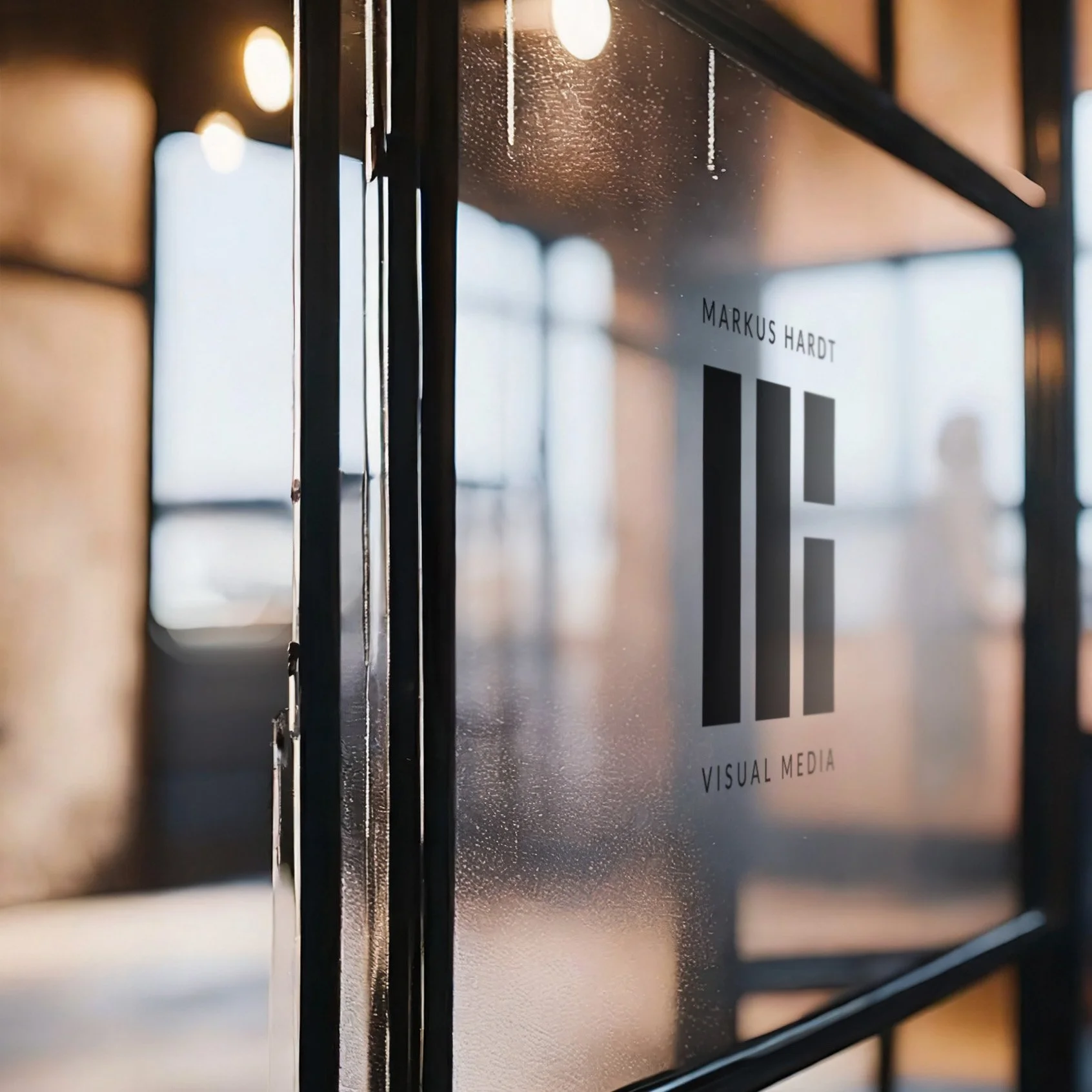
I want to wrap up this study with some mockup designs. What’s special here is that the background images are all completely AI-generated using a text-to-image model with specific prompts. At the time of this writing, those image models did not handle an input logo with text well, so I had to use the workaround of creating the background image and then manually integrating my logo using photoshop the “old-fashioned” way. The advantage of this method is that the mockups are still unique - in constrast to using templates or stock imagery.